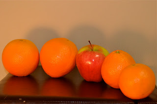
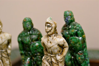
The project was to search for shapes that are repeating. I will be honest that I didn't quite understand what the assignment meant by shape. It wasn't till recently did I look back at the Line, Shape and Pattern powerpoint and reread what was said about shape. It read: "Shapes are the result of a series of lines that come together to form a circle, square, triangle, and so on. Just like lines, the shape of your subject creates its own dynamic whether it’s round, square, triangular, free-form and so forth. Lines often lead to shapes, giving your images form." Thus I am now looking back at my two photo sets and realizing that they aren't really of shape as much as design or layout. At least by this definition of shape. On the other hand, I looked at some photos of 'Shape/ repetition photography' on google images and I noticed that many photos were very similar to mine of fruit and chess pieces. Instead of doing what that definition said of Shape (which again, I forgot about until recently) I decided to create my own unique design that involves repetition. If I had more oranges, I would have used them, but alas I did not. Also it was dark, cold and damp outside by the time I took these, so I really didn't want to walk to the store to buy more oranges. I also wish the apple had been more bold and sharp. I used a lamp to provide additional lighting, but now that I look back at the 20 photos, I think that if I used a different lighting, they might have turned out a bit better. I shot in Aperture priority mode for these fruit photos, and changed to the Close up mode (Flower symbol) mode for the Chess setup.
I made sure that I never changed the setup, I would either move to take some of the photos or move the stool in which the fruit was resting upon in order to get the photos I wanted.
The shadows are nice in this photo.
One of my favourites, in my opinion
I would have liked using a black background for these fruit, to match the footstool, and now that I look back, I wonder why I never thought of that until now. I'm positive that I have some kind of black blanket at my house, and I regret that I never thought about using it until now. I had a number of other ideas for repeating objects, maybe I will take some photos of them with a black background.
I took this one for the partial reflection in the black leather of the footstool , I'd say it turned out pretty well.
My favourite of the fruit shots ^
I like this one because of the bold colours and waxy like coating on the apple and oranges.
Maybe it was a good thing the apple wasn't completely red, the green stands out very nicely in this photo
A shot from behind. I turned the setup around to take this shot and I was tempted to turn the apple around to get the red, but I resisted the temptation to tamper with my design.
I like the sticker in this photo.
Perhaps if I cropped the photo a bit or better yet had a macro lens (I'd really love to get a macro lens, or a good telephoto lens) I'd be able to zoom right into the bottom of the orange.
I wanted to try to capture the bold, deep red of the apple beside the orange of the oranges. Why did the only apple in my house have to be only semi-red? We need more fruit in my house, I and the rest of my family need to eat better. At least I think so
Again, a black background would have made these shots better, but the sharpness of the first orange makes the photo stand out.
One of my favourites
A little too bright and once again I wish I had used a black background. I feel I should have changed the settings or moved the lamp for this photo, it's just too bright.
I took 20 more shots of a different layout. This time I used a chess set. My family is obsessed with chess, we have at least five or six chess sets. Maybe that's not obsession, but I'd still consider it a lot. Not to say that I don't enjoy chess, it can be a very interesting, strategic and time consuming game. I don't remember where we got this chess board, but I've always really liked it for its unique style. The green marble pieces are the 'black pieces' and the white marble pieces are the 'white pieces', obviously. In order to make the design appear more like a shape or repetition, I only used the pawn pieces, instead of the bishops or queen...which actually look more interesting. Like with the orange / apple design, I did not move my design at all, I only shot pictures of it from different angles.
My favourite ^
The board reminds me of an Aztec or Inca style, which I like seeing as how I love South America and its culture.
A good photo, but I wish I would have gotten all 4 pieces in focus.
Not the best photo, I'll admit.
notice the one piece without a head. I think......well I know that my brother and I were responsible somehow for the beheading of the pawn's head, but I can't remember how.
Wish I didn't get the brick background in this photo, but it does provide a bit of variety to my backgrounds.
I was trying to capture the detail of the board's pattern.
I found it difficult at times trying to take 20 shots of the same subject, from different angles. At first I thought, 20 shots isn't that hard; but wow....I was surprised at how difficult it was to try and think of "how can I take 20 shots, all from different angles of the same subject."
The heads remind me more of Aztec art / sculpture rather than Inca.
One of my favourites
This photo was very difficult to take. I tried a number of times to zoom in on the white piece's shield, but each time my camera couldn't focus properly or was lagging for minutes at a time. So, I was finally able to focus (as I was able to previous times, but when I tried taking the photos, they never turned out) , and then I switched quickly to manual mode and took the shot. Nice, detailed shot.


No comments:
Post a Comment